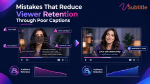
Captions are supposed to keep people watching. Done badly, they do the opposite — and most creators never realize the caption is what made someone leave.
Captions have become baseline infrastructure for video in 2026, not an optional add-on — driven by sound-off viewing habits now estimated above 70% on mobile, tightened accessibility enforcement, and the reality that short-form video delivers the highest marketing ROI of any video format. The problem is that “has captions” and “has good captions” get treated as the same achievement, and they aren’t. Raw, unreviewed auto-generated captions typically carry a 5–10% word error rate, and errors in brand names, technical terms, and homophones are exactly the kind of mistake that turns a caption from a retention tool into a retention leak.
This guide walks through the specific caption mistakes that quietly cost creators and brands watch time — some obvious once named, others easy to miss even in an otherwise careful production process — along with what actually fixes each one.
Why Caption Quality Is a Retention Problem, Not Just a Polish Problem
A caption doesn’t need to be wrong to hurt retention — it just needs to add friction between the viewer and understanding what’s happening on screen. Every extra half-second spent squinting at small text, re-reading a garbled phrase, or losing a caption behind an interface element is a small tax on attention, and attention is the one resource a viewer won’t get back once they’ve scrolled away. Multiply that friction across dozens of small moments in a single video, and a technically “captioned” piece of content can still underperform an uncaptioned one produced with more care.
The Mistakes That Actually Cost Retention
1. Publishing Unedited Auto-Generated Captions
Raw auto-captions carry a meaningful error rate even with clean audio, and the errors cluster exactly where they hurt most: brand names, technical terms, acronyms, and unusual proper nouns. A SaaS product’s core metric turned into nonsense, a medical term transcribed incorrectly, a founder’s own company name spelled wrong throughout an interview — these don’t just look unprofessional, they actively damage comprehension and credibility in exactly the high-trust content where accuracy matters most.
The fix: treat auto-captions as a first draft, not a final deliverable, with every line reviewed at minimum for names, numbers, and specialized vocabulary before publishing.
2. Text That’s Too Small to Read Comfortably
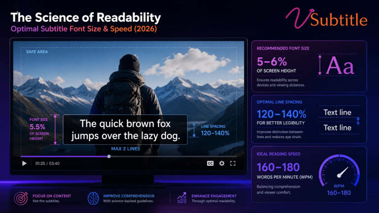
Captions sized for a desktop preview routinely fail on the actual device most viewers use. Undersized text forces a choice between straining to read and giving up — and research on this specifically finds that captions too small to read comfortably hurt retention more than captions that feel slightly oversized, meaning the safer error, if one has to be made, is erring larger rather than smaller.
The fix: test captions on the smallest phone screen realistically expected in the audience, not just a desktop editor’s preview window, and size text so it’s comfortably readable without zooming.
3. Poor Timing and Sync
Captions that appear too early, linger too long, or shift out of sync with shot changes break the connection between what’s said and what’s shown. Professional timing practice keeps each caption on screen for roughly one to six or seven seconds, synchronized to cuts and shot changes, with faster-paced scenes getting shorter captions so the viewer can read and still follow the visual action rather than being forced to choose one or the other.
The fix: sync captions to natural speech and shot boundaries rather than a rigid, evenly spaced timing pattern, and shorten captions during fast-cut sequences specifically.
4. Reading Speed That Outruns the Viewer
The widely used professional ceiling sits around 17–20 characters per second for adult content, lower for children’s programming. Captions timed faster than that ask viewers to choose between finishing the line and following the video — and most viewers, faced with that choice repeatedly, choose to stop watching rather than keep working to keep up.
The fix: check reading speed directly rather than assuming a caption “looks about right” — split long lines or extend display duration rather than compressing text into a shorter window than a viewer can realistically read.
5. Low Contrast and Poor Font Choices
Thin fonts, low-contrast color combinations, and styling that looks fine against one background but disappears against another are a common failure point, especially once creators start customizing caption style away from a platform’s tested default. TikTok’s own default style — white text with a black stroke — exists because it holds up reliably across a huge range of backgrounds; many customization mistakes happen exactly when creators move away from that kind of proven, high-contrast baseline in favor of something that looks better in a single preview frame but fails elsewhere in the video.
The fix: keep a strong stroke or shadow on any custom caption style, and check legibility across the actual range of backgrounds the video moves through, not just one representative frame.
6. Captions Hidden Behind Platform Interface Elements
A technically well-made caption that lands underneath a platform’s interaction icons, progress bar, or caption-field text is functionally invisible — a completely preventable failure that has nothing to do with the caption’s wording or timing and everything to do with where it sits in the frame. This is an increasingly common mistake as platforms expand their own UI footprint over time, meaning safe-zone guidance that was accurate a year or two ago can quietly go stale.
The fix: preview finished video on an actual device before publishing, checking specifically for overlap with current platform UI — not just the safe-zone measurements used the last time captions were styled.
This is a mistake with a direct fix built into a platform-specific workflow — our Instagram Reel caption generator accounts for current safe-zone placement automatically, which removes this failure mode without requiring a manual re-check on every upload.
7. Mistranslated or Poorly Adapted Subtitles for Global Audiences
Direct, literal translation frequently breaks subtitle timing, because languages don’t carry the same information density as the source. A short, punchy line in English can run noticeably longer once translated into Spanish or Arabic, and if the translated caption isn’t re-timed and re-fit to the same display window, it either gets cut off, overruns the reading-speed ceiling, or has to be paraphrased so aggressively that meaning gets lost.
The fix: treat translation as requiring its own timing and length pass, not a word-for-word swap into the original caption file’s exact structure.
8. Delivering the Wrong Type of Captioning for the Audience
Subtitles (dialogue only) and closed captions (dialogue plus sound effects, music cues, and speaker identification) serve different audiences, and most accessibility regulations — including the EU’s Accessibility Act — specifically require captions, not plain subtitles. Briefing a project for the wrong one is a common and costly mistake: a viewer who’s deaf or hard of hearing loses critical non-dialogue information from a subtitle-only file, regardless of how accurate the dialogue portion is.
For a deeper look at what separates the two and why the distinction matters beyond just compliance, our guide to making video content deaf-friendly covers this directly.
9. Caption Controls That Are Present but Hard to Find or Use
Captions existing in a file somewhere isn’t the same as captions being genuinely accessible to a viewer. Regulatory attention has started extending specifically to this gap — new rules require covered devices and platforms to make caption display settings easy to find, preview, and consistently apply, not just technically present in the content. A viewer who can’t figure out how to turn captions on, or whose settings don’t persist between videos, experiences a caption failure just as real as a missing file.
The fix: this one is largely a platform and player responsibility rather than a per-video fix, but for embedded or custom players specifically, make sure caption toggles are visible, labeled clearly, and remember the viewer’s preference.
10. No Review Gate at Production Scale
Teams producing high volumes of clipped or repurposed video are especially prone to this: automation handles clipping, caption generation, and scheduling, but without a mandatory human review step for names, numbers, claims, and placement, errors from mistake #1 flow straight through to publish at scale rather than being caught once and fixed.
The fix: build a review gate into the workflow before the content queue fills, approving only versions that pass an accuracy and placement check — treating review as a required stage, not an optional polish step squeezed in when time allows.
A Practical Standard for “Good Enough to Publish”
A useful way to judge whether a caption is ready is to separate two categories of error rather than chasing zero mistakes of any kind. A word error is a missed or incorrect word that doesn’t change meaning — a minor imperfection. A meaning error changes what the speaker actually intended, or could cause a viewer to misunderstand the message. The practical bar: no meaning errors, ever, and word errors only when they genuinely don’t affect clarity. If there’s a real chance a viewer could misread the message because of a caption mistake, it isn’t publish-ready yet, regardless of how minor the error looks in isolation.
Building a Workflow That Catches These Mistakes Before Publishing
- Generate an initial caption draft automatically, then treat it explicitly as a draft rather than a finished asset.
- Review every line for names, numbers, technical terms, and homophones — the specific categories auto-captioning gets wrong most often.
- Check reading speed and timing against the roughly 17–20 CPS ceiling, adjusting display duration rather than leaving lines that outrun a viewer’s reading pace.
- Preview on an actual small-screen device, checking both text size and placement against current platform UI, not assumptions from an older safe-zone guide.
- Confirm the right captioning type is being delivered — full captions with sound and speaker information where accessibility is the goal, not dialogue-only subtitles mistaken for the same thing.
- For translated content, budget a separate timing and length pass rather than assuming a translated file will fit the source file’s exact structure.
- Build the review step into the production pipeline itself, so it happens before publishing at scale, not as an occasional audit after problems are already live.
vSubtitle supports this workflow directly: its AI subtitle generator produces an accurate first-draft transcript with an editor built for the kind of quick correction this checklist calls for, and translation into 100+ languages includes the re-timing needed to keep translated captions properly synced rather than stretched or cut off. For teams building this discipline into a new or growing captioning process, our beginner’s guide to AI subtitling and our guide to AI subtitles and video SEO are useful next steps, and our broader look at where AI subtitling is headed in 2026 covers how caption quality standards are continuing to rise across the industry.
Key Takeaways
- Unedited auto-captions carry a meaningful error rate, and the errors cluster around brand names, technical terms, and proper nouns — exactly the content most likely to damage credibility when wrong.
- Undersized text hurts retention more than slightly oversized text; always test on the smallest realistic screen, not a desktop preview.
- Reading speed above roughly 17–20 CPS asks viewers to choose between finishing a caption and following the video, and most choose to stop watching instead.
- Captions hidden behind platform UI are a completely preventable failure that has nothing to do with wording — safe-zone guidance needs to be checked against current platform layouts, not outdated measurements.
- Translated subtitles need their own timing pass, since languages don’t carry equivalent information density and a direct swap into the source file’s structure frequently breaks sync.
- The practical quality bar is zero meaning errors, with minor word errors acceptable only when they don’t risk a viewer misunderstanding the message.
None of these mistakes require an enterprise budget to avoid — they require a review step that actually happens before publishing, applied consistently rather than as an occasional afterthought. That single habit closes most of the gap between captions that technically exist and captions that actually keep people watching.
Frequently Asked Questions (FAQs)
How accurate do auto-generated captions typically need correcting to be?
Raw auto-captions typically carry a 5–10% word error rate, with mistakes concentrated in brand names, technical terms, and homophones. A practical accuracy bar is zero meaning errors — nothing that could cause a viewer to misunderstand the message — with minor word errors acceptable only when they don’t affect clarity.
What’s the maximum reading speed captions should stay under?
The widely used professional ceiling is roughly 17–20 characters per second for adult content, and lower for children’s programming. Captions timed faster than that risk losing viewers who can’t finish reading before the line disappears.
Why do captions sometimes get cut off or overrun when translated?
Languages carry different information density — a short English line can run significantly longer once translated into Spanish or Arabic, for example. If the translated caption isn’t given its own timing and length adjustment, it can overrun the display window or force overly aggressive paraphrasing that loses meaning.
What’s the difference between subtitles and closed captions, and why does it matter for retention?
Subtitles translate dialogue only; closed captions include dialogue plus sound effects, music cues, and speaker identification. Delivering subtitles when captions were needed — a common mistake — leaves deaf and hard-of-hearing viewers without critical non-dialogue information, regardless of how accurate the dialogue text is.
Why do captions sometimes get hidden behind a platform’s interface?
Platforms periodically expand their own UI — progress bars, interaction icons, caption-field text — and safe-zone guidance that was accurate previously can go stale. Captions styled against outdated measurements can end up hidden behind current interface elements, a fully preventable issue caught by testing on an actual device before publishing.
Is it better to make captions slightly larger or slightly smaller when unsure?
Slightly larger. Research on this specifically has found that captions too small to read comfortably hurt retention more than captions that feel a little oversized, making oversized the safer default when in doubt.
How can teams producing a high volume of video avoid these mistakes consistently?
By building a mandatory review gate into the production workflow itself — checking accuracy, timing, and placement before content is approved to publish — rather than relying on automation alone or treating review as optional polish squeezed in when time allows. AI captioning tools can generate the first draft quickly, but the review step is what actually prevents these mistakes from reaching viewers.