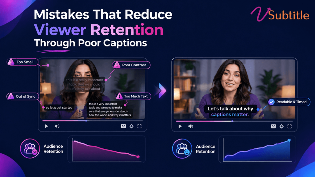
Mistakes That Reduce Viewer Retention Through Poor Captions
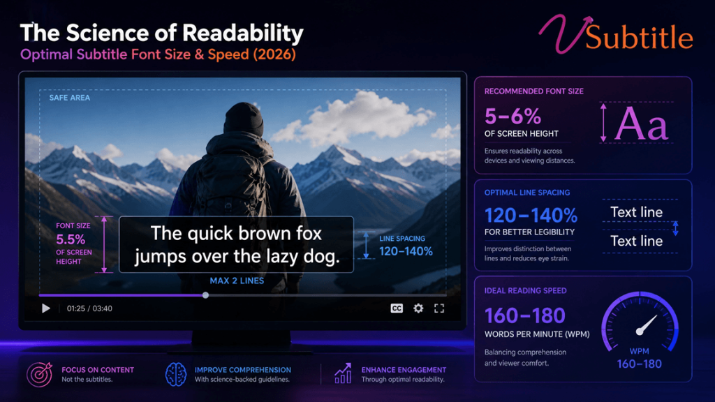
Captions are supposed to keep people watching. Done badly, they do the opposite — and most creators never realize the caption is what made someone leave. Captions have become baseline infrastructure for video in 2026, not an optional add-on — driven by sound-off viewing habits now estimated above 70% on mobile, tightened accessibility enforcement, and the reality that short-form video delivers the highest marketing ROI of any video format. The problem is that “has captions” and “has good captions” get treated as the same achievement, and they aren’t. Raw, unreviewed auto-generated captions typically carry a 5–10% word error rate, and errors in brand names, technical terms, and homophones are exactly the kind of mistake that turns a caption from a retention tool into a retention leak. This guide walks through the specific caption mistakes that quietly cost creators and brands watch time — some obvious once named, others easy to miss even in an otherwise careful production process — along with what actually fixes each one. Why Caption Quality Is a Retention Problem, Not Just a Polish Problem A caption doesn’t need to be wrong to hurt retention — it just needs to add friction between the viewer and understanding what’s happening on screen. Every extra half-second spent squinting at small text, re-reading a garbled phrase, or losing a caption behind an interface element is a small tax on attention, and attention is the one resource a viewer won’t get back once they’ve scrolled away. Multiply that friction across dozens of small moments in a single video, and a technically “captioned” piece of content can still underperform an uncaptioned one produced with more care. The Mistakes That Actually Cost Retention 1. Publishing Unedited Auto-Generated Captions Raw auto-captions carry a meaningful error rate even with clean audio, and the errors cluster exactly where they hurt most: brand names, technical terms, acronyms, and unusual proper nouns. A SaaS product’s core metric turned into nonsense, a medical term transcribed incorrectly, a founder’s own company name spelled wrong throughout an interview — these don’t just look unprofessional, they actively damage comprehension and credibility in exactly the high-trust content where accuracy matters most. The fix: treat auto-captions as a first draft, not a final deliverable, with every line reviewed at minimum for names, numbers, and specialized vocabulary before publishing. 2. Text That’s Too Small to Read Comfortably Captions sized for a desktop preview routinely fail on the actual device most viewers use. Undersized text forces a choice between straining to read and giving up — and research on this specifically finds that captions too small to read comfortably hurt retention more than captions that feel slightly oversized, meaning the safer error, if one has to be made, is erring larger rather than smaller. The fix: test captions on the smallest phone screen realistically expected in the audience, not just a desktop editor’s preview window, and size text so it’s comfortably readable without zooming. 3. Poor Timing and Sync Captions that appear too early, linger too long, or shift out of sync with shot changes break the connection between what’s said and what’s shown. Professional timing practice keeps each caption on screen for roughly one to six or seven seconds, synchronized to cuts and shot changes, with faster-paced scenes getting shorter captions so the viewer can read and still follow the visual action rather than being forced to choose one or the other. The fix: sync captions to natural speech and shot boundaries rather than a rigid, evenly spaced timing pattern, and shorten captions during fast-cut sequences specifically. 4. Reading Speed That Outruns the Viewer The widely used professional ceiling sits around 17–20 characters per second for adult content, lower for children’s programming. Captions timed faster than that ask viewers to choose between finishing the line and following the video — and most viewers, faced with that choice repeatedly, choose to stop watching rather than keep working to keep up. The fix: check reading speed directly rather than assuming a caption “looks about right” — split long lines or extend display duration rather than compressing text into a shorter window than a viewer can realistically read. 5. Low Contrast and Poor Font Choices Thin fonts, low-contrast color combinations, and styling that looks fine against one background but disappears against another are a common failure point, especially once creators start customizing caption style away from a platform’s tested default. TikTok’s own default style — white text with a black stroke — exists because it holds up reliably across a huge range of backgrounds; many customization mistakes happen exactly when creators move away from that kind of proven, high-contrast baseline in favor of something that looks better in a single preview frame but fails elsewhere in the video. The fix: keep a strong stroke or shadow on any custom caption style, and check legibility across the actual range of backgrounds the video moves through, not just one representative frame. 6. Captions Hidden Behind Platform Interface Elements A technically well-made caption that lands underneath a platform’s interaction icons, progress bar, or caption-field text is functionally invisible — a completely preventable failure that has nothing to do with the caption’s wording or timing and everything to do with where it sits in the frame. This is an increasingly common mistake as platforms expand their own UI footprint over time, meaning safe-zone guidance that was accurate a year or two ago can quietly go stale. The fix: preview finished video on an actual device before publishing, checking specifically for overlap with current platform UI — not just the safe-zone measurements used the last time captions were styled. This is a mistake with a direct fix built into a platform-specific workflow — our Instagram Reel caption generator accounts for current safe-zone placement automatically, which removes this failure mode without requiring a manual re-check on every upload. 7. Mistranslated or Poorly Adapted Subtitles for Global Audiences Direct, literal translation frequently breaks subtitle timing, because languages don’t carry the same information density as