How eye-tracking research, streaming style guides, and accessibility law are shaping the way we size and time subtitles this year.
Every subtitle on screen is a small negotiation between two competing needs: the viewer’s eyes have to leave the image, decode a block of text, and return to the picture before anything important happens. Get the timing or the size wrong, and one of two things happens — either the viewer misses the dialogue, or they miss the video. Readability isn’t a style preference. It’s a measurable outcome, and in 2026 it’s backed by more data than ever: eye-tracking studies, platform-published style guides, and accessibility regulations that are now legally enforceable across major markets.
This guide breaks down exactly what “readable” means for subtitles today — the font sizes that hold up across devices, the reading-speed limits that separate professional captions from amateur ones, and the layout choices that keep text out of the way of the story. Whether you’re publishing a YouTube tutorial, a vertical Reel, or a broadcast-ready documentary, these numbers are the difference between subtitles people read comfortably and subtitles people give up on.
Why Subtitle Readability Is a Science, Not a Guess
Reading subtitled video is a fundamentally different cognitive task than reading a book or a webpage. The viewer’s gaze has to split its attention between two sources of information — the moving image and the on-screen text — and constantly decide where to look next. Eye-tracking research on subtitled content consistently shows the same pattern: viewers spend a large share of their viewing time fixated on the subtitle line itself, glancing up at the picture in short bursts. If the text is too small, too dense, or on screen for too short a time, that balance collapses. Viewers either abandon the picture to keep reading, or abandon the subtitle to keep watching — and comprehension drops either way.
That’s why the two variables covered in this article — font size and reading speed — sit at the center of subtitle design. They are the two levers most directly tied to whether a viewer can physically finish reading a line before it disappears, and whether they can do it without straining. Everything else (font choice, color, position) supports those two numbers; it doesn’t replace them.
Optimal Subtitle Reading Speed: The CPS Standard
Reading speed for subtitles is measured in characters per second (CPS) — the total character count of a subtitle line divided by the number of seconds it stays on screen. CPS is preferred over words-per-minute because word length varies wildly between languages, while character count stays a consistent, comparable unit.
The formula: CPS = total characters in the cue ÷ display duration in seconds. A 51-character subtitle shown for 3 seconds runs at 17 CPS.
Here’s how the major reading-speed benchmarks compare heading into 2026:
| Audience / Platform | Recommended CPS | Notes |
|---|---|---|
| General adult audience | 15–17 CPS | Widely cited as the comfortable baseline across broadcasters and researchers |
| Netflix (adult content) | Up to 17–20 CPS | 20 CPS is the outer limit; 17 CPS is the recommended target |
| Netflix (children’s content) | Up to 13 CPS | Slower pace accounts for developing reading skill |
| BBC | Under 15–17 CPS (≈160–180 WPM) | Designed around broadcast audiences, including older and less-fluent readers |
| FCC (US broadcast) | Up to 18 CPS | Regulatory ceiling for captioned broadcast television |
| CJK languages (Chinese, Japanese, Korean) | 9–12 CPS | Each character carries more information, so lower CPS reads at an equivalent pace to 17–20 CPS in Latin scripts |
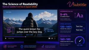
Push past roughly 20 CPS and most adult viewers can no longer finish reading a line before it disappears — they either fall behind or stop reading text entirely and rely on audio and visuals alone. Go much below 12 CPS, and subtitles start to feel sluggish, lingering on screen after the line has already been read. The sweet spot for most 2026 content — social, educational, corporate, and long-form video alike — is 15 to 17 CPS, with a hard ceiling around 20 CPS for fast-paced dialogue.
Minimum and Maximum Cue Duration
CPS alone doesn’t capture everything. Two additional timing rules matter just as much:
- Minimum duration: a cue should stay on screen for at least 5/6 of a second, and ideally closer to 1 second, even for very short lines like a single “No.” Anything shorter reads as a flash the eye can’t register.
- Maximum duration: cues shouldn’t linger past roughly 7 seconds. Beyond that, viewers tend to re-read the line, which breaks their connection to the video.
- Gap between cues: leave at least one frame of blank space between two consecutive subtitles. Back-to-back cues with zero gap read as a single flickering block of text.
Why This Number Is Higher Than It Used To Be
Streaming platforms pushed reading-speed limits upward over the last decade. Traditional broadcast subtitling in many regions was built around 10–12 CPS; Netflix’s style guide normalized 17 CPS, with flexibility up to 20. That shift reflects an audience trained on fast-cut, caption-heavy content — but it isn’t universal. Regulators in the UK and EU are actively working to bring streaming captioning in line with traditional broadcast accessibility standards, and research comparing regions shows real friction between fast, streaming-era pacing and audiences accustomed to slower, more traditional subtitling. The practical takeaway for 2026: 17 CPS is a safe, well-supported default. Treat 20 CPS as a ceiling for fast dialogue, not a target, and drop to 12–13 CPS for children’s content, educational material, or any audience that skews toward less-fluent readers.
Optimal Subtitle Font Size for 2026
Font size isn’t a fixed pixel number — it’s a ratio. What matters is how large the text appears relative to the frame it sits in and the distance the viewer sits from the screen. A rule of thumb used across broadcast and accessibility guidelines: set subtitle text height to somewhere between 1/20 and 1/10 of the frame height, with a recommended floor of around 44px for HD (1080p) video. From there, the exact number shifts by platform and orientation.
| Format / Platform | Source Resolution | Recommended Font Size |
|---|---|---|
| Horizontal long-form (YouTube, LinkedIn) | 1920×1080 | 24–32 px (≈16–18 pt on desktop-style previews) |
| Vertical short-form (TikTok, Reels, Shorts) | 1080×1920 | 36–48 px, often pushed to 48–60 px for maximum legibility |
| Square (Instagram feed) | 1080×1080 | 28–36 px |
| Broadcast TV delivery | 1920×1080 | 30–36 px, per network spec |
| 4K export (any format) | 3840×2160 | Double the 1080p value to preserve the same visual size |
Vertical, mobile-first formats consistently need larger type than horizontal video. There are two reasons: phones are viewed at arm’s length rather than across a room, and platform interface elements — TikTok’s navigation bar, Instagram’s like and comment icons, YouTube Shorts’ progress bar — eat into the usable frame, especially the bottom 20–25%. That’s also why vertical captions are typically centered higher on the screen (roughly 60–75% of frame height from the top) rather than sitting in a traditional lower-third position.
A Practical Sizing Test
If you don’t want to calculate ratios by hand, use this test: export a sample clip, open it on an actual phone (not a desktop preview), hold it at a normal arm’s-length distance, and check whether you can read a full subtitle line in under one second without leaning in. If you can’t, the font is too small — regardless of what the pixel value technically meets on paper. Desktop editors routinely make captions look larger than they’ll appear on the device most viewers actually use.
Line Length and Line Count
Font size and line length are linked. Longer lines need to shrink to fit the frame, which quietly undermines readability even if the pixel size looks correct in isolation. The widely adopted defaults:
- 42 characters per line — the streaming-era standard used by Netflix and recommended by YouTube.
- 32–37 characters per line — used by broadcasters like the BBC and by short-form/vertical platforms with narrower usable width.
- Two lines maximum per cue. A third line pushes text into the middle of the frame and competes directly with the picture.
Font Choice, Weight, and Contrast
Size determines whether text can be read; typeface and contrast determine how much effort it takes. Both affect the same underlying goal — minimizing the time and strain required to decode each line.
Typeface
Clean, humanist sans-serif fonts remain the standard for subtitles for a simple reason: their letterforms are easy to distinguish at small sizes and in motion. Arial, Helvetica Neue, Roboto, Open Sans, Inter, and Montserrat are the most commonly recommended options across broadcasters, streaming platforms, and accessibility guidelines. Decorative, script, or handwritten fonts should be avoided entirely — they look distinctive in a still frame but cost the viewer meaningfully more time to parse, and that cost compounds over a full video.
Weight and Line Spacing
Medium-to-bold weights hold up better against busy or high-motion backgrounds than thin or regular weights. Pair that with a line-height of roughly 1.2 to 1.6 times the font size so stacked two-line cues don’t feel cramped.
Contrast
The most reliable combination remains white or off-white text with a dark outline or semi-transparent background box — it holds up across bright scenes, dark scenes, and everything in between. Accessibility guidelines generally call for a contrast ratio of at least 4.5:1 for normal text, with many broadcast specs recommending closer to 7:1 for small subtitle text specifically. A 2–4px dark stroke or drop shadow around light text is the simplest way to guarantee legibility regardless of what’s happening in the footage underneath.
Positioning: Where Subtitles Should Sit
| Format | Recommended Position |
|---|---|
| Horizontal (YouTube, broadcast) | Lower third, 85–90% of frame height, respecting a 5% title-safe margin from each edge |
| TikTok | Centered, 60–70% of frame height from the top |
| YouTube Shorts | 65–75% of frame height, above the progress bar and UI |
| Instagram Reels | 60–70% of frame height, clear of comment/like icons |
The underlying principle is the same across formats: keep subtitles clear of any platform interface elements, faces, or key visual action, and keep their position consistent throughout the video so the viewer’s eye learns exactly where to look without having to search.
Accessibility and Compliance: Why This Isn’t Optional in 2026
Subtitle readability has moved from a best practice to a compliance requirement in most major markets. The FCC mandates captioning for a wide range of US video content. The EU Accessibility Act, in effect since 2025, extends digital accessibility obligations to a broad range of online content and services. The UK is actively working to bring streaming captioning standards closer to traditional broadcast accessibility rules. WCAG guidance underpins much of this regulatory language, and its contrast and readability principles apply directly to how captions should look and behave.
For a global audience, this also means designing for the full range of readers — including people who are deaf or hard of hearing, non-native speakers, older viewers, and people watching in noisy or sound-off environments (a majority of social video is watched muted). Readable, well-timed subtitles aren’t just a legal checkbox; they’re what actually determines whether a captioned video is usable for the audience it’s meant to serve.
Getting the Numbers Right Without Doing the Math Yourself
Manually policing CPS, line length, and font sizing across an entire video — let alone an entire channel — is tedious and easy to get wrong, especially once translation is involved (translated subtitles are frequently longer than the source language and need re-condensing to stay within CPS limits). This is exactly the kind of enforcement that’s better handled automatically than by eye.
vSubtitle’s AI subtitle generator builds these standards into the editing workflow rather than leaving them as a manual QC step. It enforces characters-per-second limits, line length, and title-safe positioning as subtitles are generated, flags cues that run too fast or too dense, and applies high-contrast, legible style presets tuned for social feeds, e-learning, and broadcast delivery. Reading-speed guidance is built in for each context, so creators aren’t guessing at the right CPS for a children’s explainer versus a fast-cut social clip. Combined with support for 100+ languages and export to SRT, VTT, TXT, and DFXP, it’s built to get subtitles readable — and compliant — on the first pass, not the fifth.
Key Takeaways
- Target 15–17 CPS for most adult content; treat 20 CPS as a hard ceiling, not a goal. Drop to 12–13 CPS for children’s or lower-literacy audiences.
- Size subtitles as a ratio of frame height, not a fixed pixel value — roughly 1/20 to 1/10 of frame height, larger for vertical/mobile formats.
- Cap lines at 42 characters (32–37 for BBC-style or narrow vertical formats) and never exceed two lines per cue.
- Use clean sans-serif fonts, medium-to-bold weight, and strong contrast (white text with a dark outline or box) to minimize reading effort.
- Position subtitles consistently, clear of platform UI elements, and always test on the actual device your audience will use.
- Treat readability as a compliance requirement, not a nice-to-have — WCAG, the EU Accessibility Act, and FCC rules all touch on it directly.
Get these fundamentals right and subtitles stop being a barrier between the viewer and the content — they become invisible in the best possible way: read effortlessly, in sync, without ever pulling attention away from the story.
Frequently Asked Questions
What is the ideal subtitle reading speed?
For most adult audiences, 15–17 characters per second (CPS) is the professional standard. Netflix allows up to 20 CPS for adult content and 17 CPS for children’s content, while broadcasters like the BBC generally favor the slower end of that range to accommodate a wider range of readers.
What font size should I use for subtitles?
Set subtitle text to roughly 1/20 to 1/10 of the frame height. In practice, that’s about 24–32px for horizontal 1080p video and 36–48px (sometimes up to 60px) for vertical formats like TikTok, Reels, and Shorts, where viewers watch at arm’s length on smaller screens.
Why is CPS used instead of words per minute for subtitles?
Word length varies significantly between languages, which makes words-per-minute an unreliable universal measure. Character count stays consistent across languages, making CPS a more accurate way to gauge how much text a viewer actually has to process in a given amount of time.
How many characters per line should a subtitle have?
42 characters per line is the streaming-era standard, used by Netflix and recommended by YouTube. Broadcasters such as the BBC typically use a narrower limit around 37 characters, and vertical short-form video often needs to stay even tighter to fit the narrower frame.
What’s the best font for subtitles?
Clean sans-serif fonts with a tall x-height and clear letter distinction — Arial, Helvetica Neue, Roboto, Open Sans, Inter, and Montserrat are the most commonly recommended. Avoid script, handwritten, or heavily decorative fonts, which slow reading speed even when they look stylish.
Do vertical videos need a different subtitle size than horizontal videos?
Yes. Vertical formats are typically viewed on phones at arm’s length, and platform interface elements occupy a large portion of the bottom of the screen, so captions generally need to be larger and positioned higher — around 60–75% of frame height from the top — compared with the traditional lower-third placement used in horizontal video.
Is there a legal requirement for subtitle readability?
In several major markets, yes. The FCC mandates captioning for a wide range of US video content, the EU Accessibility Act (in effect since 2025) covers digital content broadly, and the UK is extending broadcast-style accessibility rules to streaming services. WCAG guidelines on contrast and readability underpin much of this regulatory language.
How can I check if my subtitles meet these standards automatically?
AI-powered tools like vSubtitle can enforce CPS limits, line length, and title-safe positioning directly during subtitle generation and editing, flagging cues that run too fast or too dense so you don’t have to check every line manually.