
The exact sizes, safe zones, and formatting rules that separate a Reel people actually watch from one they scroll past in the first second.
Most Reels are lost in the first second, and most of that loss has nothing to do with the idea, the hook, or the edit — it comes down to whether the on-screen text is actually readable on a phone held at arm’s length, with the sound off, while Instagram’s own interface is covering a growing share of the frame. More than 85% of Reels are watched without sound, which means the caption isn’t a nice-to-have layered on top of the video. For most of the audience, it is the video.
2026 has raised the stakes further. Instagram’s interface now eats into more of the vertical frame than it used to, its search algorithm weighs on-screen text almost as heavily as the written caption field, and viewer expectations for polish have risen across every short-form platform. This guide covers exactly what’s changed, the specific font sizes and safe-zone measurements that hold up on a modern Reels frame, and the formatting choices that keep captions readable instead of quietly costing watch time.
Two Different Things Called “Captions” — Get Both Right
Instagram Reels has two entirely separate things people call “captions,” and mixing them up is one of the most common planning mistakes creators make:
- On-screen text captions (subtitles): the burned-in or timed text overlaid on the video itself — what a viewer reads while watching, and what this guide focuses on.
- The caption field: the written text block published alongside the Reel, capped at roughly 2,200 characters including hashtags and mentions — what drives search, context, and the scroll-stopping first line in the feed.
Both matter, and in 2026 they increasingly work together: Instagram’s search and recommendation systems read on-screen text through OCR and weigh it alongside the written caption field, so a Reel with clear, accurate on-screen text and a well-written caption gets a stronger combined signal than either one alone.
Font Size: The 2026 Numbers
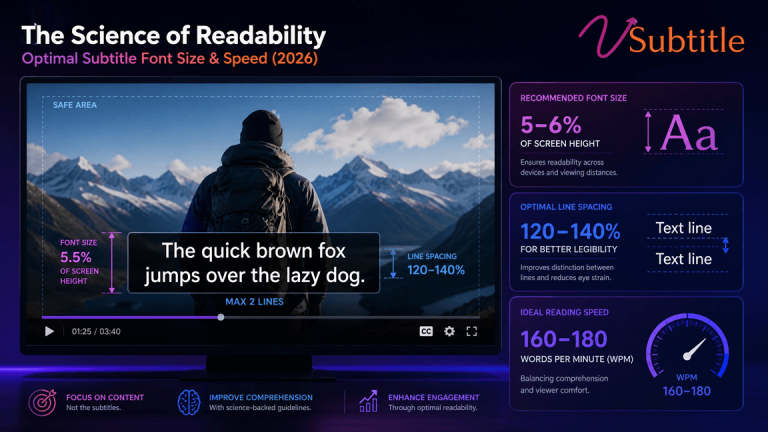
For a standard 1080×1920 Reels frame, the reliable range is 60–75px for on-screen text, which works out to roughly 3–4% of frame height. Below about 45–48px, legibility drops sharply for muted viewers glancing at a phone rather than reading closely; above roughly 100px, captions start visually competing with the video itself rather than supporting it.
| Caption Style | Recommended Size | Notes |
|---|---|---|
| Standard full-sentence captions | 60–75px | Two lines maximum per on-screen block |
| Bold/Extrabold weight (700–900) | As low as 60px | Heavier weights stay legible at smaller sizes than thin or regular weights |
| Thin or regular weight | Toward 75px+ | Needs more size to compensate for lower stroke contrast |
| Minimum readable floor | 45–48px | Below this, a meaningful share of muted mobile viewers lose legibility |
Font weight and size are linked, not independent choices: a bold or extrabold font paired with a dark stroke can run smaller than a thin font and still read more clearly, which matters on Reels specifically because a smaller caption block leaves more of the frame for the actual content.
Safe Zones: Where Instagram’s UI Actually Sits in 2026
This is the detail that changed most significantly going into 2026. Instagram expanded its bottom interface bar in late 2025, and many older safe-zone guides still circulating online understate how much of the frame that bar now covers. Current measurements on a 1080×1920 canvas:
- Bottom buffer: leave at least 400–480px clear at the bottom of the frame (roughly 20–25% of frame height) for the caption line, audio attribution, and interaction bar.
- Right-side buffer: leave 90–120px clear along the right edge for the like, comment, share, and save icons.
- Top buffer: keep the top 200–220px clear of critical text to avoid overlap with the username and following/profile elements at the top of the frame.
- Effective safe zone: on most modern Reels layouts, this leaves a centered working area of roughly 900×1440px — meaningfully smaller than the full 1080×1920 canvas, and worth designing for directly rather than assuming the whole frame is available.
The practical rule that follows from this: place captions in the upper two-thirds of the frame by default, never in the bottom fifth, and always preview the actual Reel on a phone — not just a desktop editor — before publishing, since desktop previews routinely understate how much of the bottom frame Instagram’s UI actually covers on a real device.
Why Captions Now Double as an SEO Signal
Instagram’s discovery systems in 2026 lean more heavily on understanding what’s actually inside a video, not just its written caption and hashtags. On-screen text is read through OCR and factored into how a Reel gets matched to search queries and Explore recommendations, alongside spoken-word transcription and the written caption field. In practice, this means an accurate, well-worded on-screen caption isn’t just a viewer-experience choice anymore — it’s contributing keyword and topic signal the same way alt text or a page transcript does for a website.
This raises the cost of sloppy or unreviewed auto-captions specifically. A misheard word in the on-screen text doesn’t just look unprofessional to a viewer — it can misdirect the exact discovery signal that determines whether the Reel surfaces for a relevant search or Explore recommendation at all. Reviewing captions before publishing, particularly around names, brand terms, and niche vocabulary, protects both readability and discoverability at the same time.
How Reels Compares to TikTok and YouTube Shorts
Because Reels, TikTok, and YouTube Shorts all use the same 1080×1920 vertical frame, caption sizing guidance travels well across platforms — but the safe zones don’t line up exactly, since each platform’s interface elements sit in slightly different places:
| Platform | Distinct Safe-Zone Note |
|---|---|
| Instagram Reels | Deepest bottom buffer of the three following the late-2025 UI expansion — roughly 400–480px |
| TikTok | Right-side icon stack tends to sit slightly higher on the frame than Instagram’s, and the caption line position differs |
| YouTube Shorts | Bottom progress bar and Shorts-specific UI elements occupy a narrower but still meaningful strip at the bottom edge |
For creators repurposing one vertical video across all three platforms, the safest approach is designing to the most conservative safe zone of the group — effectively Instagram’s current bottom buffer — so the same captioned export holds up cleanly no matter where it’s published, rather than needing a separate caption pass for each platform.
Style, Contrast, and Readability
Use High-Contrast Text With a Stroke or Shadow
Instagram compresses video on upload, and thin or plain text without an outline degrades further in that process. White text with a 2px dark stroke, or a semi-transparent background box behind the text, holds up reliably across bright scenes, dark scenes, and Instagram’s own dark-mode interface.
Favor Bold Sans-Serif Over Script or Decorative Fonts
The same fonts that hold up for long-form subtitles — clean, bold, high-x-height sans-serifs — perform even better on Reels, where viewing time per caption block is shorter and there’s less opportunity for a viewer’s eye to work through an unfamiliar or decorative typeface.
Keep On-Screen Text Blocks Short
Ten words or fewer per on-screen text block is a reliable ceiling for something meant to be read in a second or two of glance time. Longer thoughts should be split across sequential blocks rather than compressed into a single dense line, even if that line technically fits the safe zone.
Center-Align by Default
Centered text handles the range of aspect ratios and crop variations Reels can be viewed in — feed, profile grid, Explore, shared to Stories — more reliably than left- or right-aligned blocks, which can drift closer to an unsafe edge depending on where the Reel is displayed.
Timing and Pacing
Reels move faster than long-form video, and caption timing needs to match that pace without becoming unreadable:
- Two lines maximum per on-screen block, matching the same ceiling used in long-form subtitling but enforced more strictly given the smaller effective safe zone.
- Subtitle block height of roughly 1.3× the font size keeps stacked lines legible without crowding.
- Word-by-word or short-phrase “karaoke-style” captions have become a popular, effective format for high-energy Reels, since they match viewers’ expectation of rapid-fire pacing — but they need a slightly larger font and stronger contrast than block captions to stay readable at speed.
- Close with a short, deliberate end screen — even just 2–3 seconds — rather than cutting hard on the last caption, giving the algorithm and the viewer a clean signal that the Reel has finished rather than glitched.
A Fast, Repeatable Captioning Workflow
- Record or edit the Reel first, keeping in mind that the bottom 20–25% and right 90–120px of the frame will be covered by Instagram’s interface — avoid framing key visual action there in the first place.
- Generate accurate captions automatically rather than typing them by hand for every Reel. This is exactly the workflow vSubtitle’s Instagram Reel caption generator is built for — upload the Reel, let AI transcribe the speech, and get synced, editable captions back in seconds rather than the 30–60 minutes manual captioning typically takes.
- Review and adjust wording quickly in the built-in caption editor, fixing any misheard words, names, or slang before export.
- Apply a caption style — size, font weight, contrast — appropriate to the content’s pace, using the size and safe-zone numbers above as a starting point rather than Instagram’s default styling, which doesn’t always account for the current UI layout.
- Export as burned-in captions for a fully self-contained file, or as SRT/VTT if the Reel is also being repurposed for YouTube Shorts or TikTok, which share the same 1080×1920 frame and similar safe-zone logic.
- Write the caption field separately, using it for searchable keywords, context, and a hook — treating it as a complement to the on-screen text rather than a duplicate of it.
- Preview on an actual phone before publishing, checking specifically that no text sits inside the bottom 400–480px or right 90–120px of the frame.
Common Mistakes That Cost Reach and Watch Time
- Using outdated safe-zone measurements from pre-2025 guides, which understate how far Instagram’s expanded bottom UI bar now reaches into the frame.
- Relying on Instagram’s default auto-captions without reviewing them — misheard words in the on-screen text also get picked up by OCR-based search, compounding a transcription error into a discoverability problem.
- Publishing a Reel with no on-screen text at all and assuming the caption field alone is enough — it isn’t, since the large majority of viewers never unmute and the caption field doesn’t appear during silent scrolling the same way on-screen text does.
- Using thin, script, or low-contrast fonts that looked fine on a desktop preview but disappear against a busy or bright background on a real device.
- Cramming a long thought into one on-screen text block instead of splitting it across two well-paced ones.
Key Takeaways
- On-screen text captions and the written caption field are two different tools — 2026’s algorithm weighs both, so neither should be skipped.
- 60–75px is the reliable font-size range for on-screen text on a 1080×1920 frame, with bold weights holding up at the smaller end of that range.
- Instagram’s expanded 2025 UI update means the bottom 400–480px and right 90–120px of the frame are now off-limits for text — keep captions in the upper two-thirds by default.
- High-contrast, bold, sans-serif captions with a stroke or shadow outperform thin or decorative fonts, especially after Instagram’s upload compression.
- Two lines maximum per on-screen block, ten words or fewer per block, and a short deliberate end screen keep pacing aligned with how Reels are actually watched.
- Always preview on an actual phone before publishing — desktop editors routinely understate how much of the frame Instagram’s real interface covers.
Getting Reels captions right is less about creativity and more about precision: the right size, the right zone, the right contrast, applied consistently across every upload. Manually re-measuring and re-styling captions for each Reel isn’t realistic at any real posting cadence, which is exactly why creators and social teams increasingly lean on a purpose-built
Instagram Reel caption generator to handle transcription, timing, and export automatically — turning a process that used to take the better part of an hour into one that takes seconds, with the editing control to fine-tune it before it goes live.
Frequently Asked Questions (FAQs)
What font size should I use for Instagram Reels captions in 2026?
60–75px is the reliable range on a standard 1080×1920 frame, equivalent to roughly 3–4% of frame height. Bold or extrabold fonts can run toward the smaller end of that range and stay legible; thin or regular weights need to run larger to compensate.
How much of the Reel frame does Instagram’s UI actually cover now?
Following Instagram’s late-2025 interface update, the safe rule of thumb is to keep captions out of the bottom 400–480px and the right-side 90–120px of a 1080×1920 frame. Many older safe-zone guides understate this, since the bottom UI bar expanded compared with earlier versions of the app.
Do I need both on-screen captions and a written caption in the caption field?
Yes — they serve different purposes. On-screen text captions reach the large majority of viewers watching muted and are read by Instagram’s OCR-based search alongside the written caption field, while the caption field itself drives searchability, context, and the hook line shown in the feed.
Should I use word-by-word karaoke-style captions or full-sentence blocks?
Both work, and the choice depends on pacing. Fast, high-energy Reels often perform well with word-by-word captions matched to speech, while more measured or informational content usually reads more clearly with short, full-sentence blocks capped at two lines.
How can I add accurate captions to Reels without manually typing them out?
AI captioning tools handle this automatically. vSubtitle’s Instagram Reel caption generator transcribes a Reel’s audio and produces synced, editable on-screen captions in seconds, with export options including burned-in captions, SRT, and VTT, cutting a manual process that typically takes 30–60 minutes down to a quick review-and-export step.
Can the same captioned Reel be reused on TikTok or YouTube Shorts?
Generally yes, since all three platforms share the same 1080×1920 vertical frame and similar safe-zone logic, though each platform’s UI overlays sit in slightly different positions — it’s worth a quick check that captions don’t land under a platform-specific button or bar before cross-posting.
Why do my captions look fine in the editor but get covered once published?
Desktop editors and preview tools often don’t render Instagram’s actual mobile interface accurately, especially after UI updates. Always preview a finished Reel on an actual phone before publishing, checking specifically that no text sits inside the current bottom or right-side safe-zone buffers.