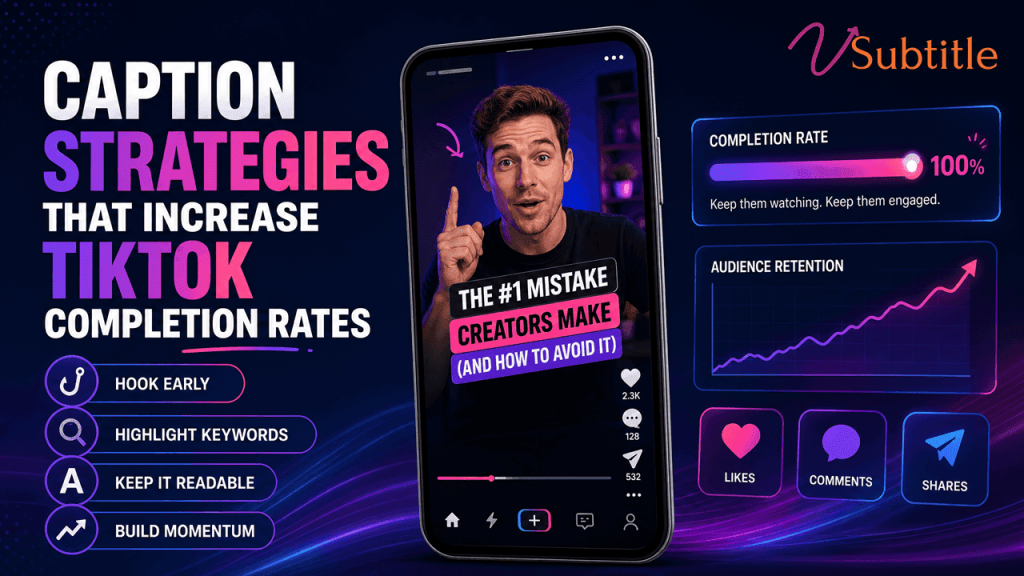
Caption Strategies That Increase TikTok Completion Rates
TikTok’s algorithm in 2026 cares about one thing above all else: whether people watch to the end. Captions are one of the few levers that move that number directly. Completion rate has become the dominant signal in TikTok’s 2026 ranking system, and the bar for triggering wider distribution has risen sharply — reports now put the viral-push threshold at roughly 70% completion, up from closer to 50% just a couple of years ago. Likes and comments still matter, but they trail far behind one blunt question the algorithm keeps asking of every upload: did the person who started watching actually stay? Captions are one of the most direct, controllable levers a creator has over that answer. Independent research into 2026 TikTok performance puts the completion-rate lift from adding captions at roughly 32%, with subtitled videos also seeing a reported 24% increase in shares — numbers large enough that caption strategy deserves the same deliberate attention as the hook or the edit, not an afterthought bolted on right before posting. This guide breaks down exactly which caption strategies move completion rate, and why, along with a practical workflow for applying them consistently. Why Completion Rate Dominates TikTok’s Algorithm in 2026 TikTok’s ranking system has consolidated around watch-through behavior as its clearest signal of genuine interest, ahead of likes, comments, or even shares. A video with far fewer views but a high completion rate consistently earns more distribution per impression than a video with many more views but a low completion rate, because completion is read as proof the content was actually worth the time it asked for. Benchmark 2026 Figure Completion rate needed to trigger viral-push distribution ~70%, up from roughly 50% in 2024 Typical completion target for videos under 15 seconds 60–70% Typical completion target for videos 30–60 seconds 40–50% Share of viewer retention decided in the first 2 seconds Over 70% Completion-rate lift from adding captions ~32% Increase in shares for captioned vs. uncaptioned videos ~24% Two things follow from this. First, the hook matters more than almost anything else, since losing a viewer in the first two seconds removes any chance captions or pacing later in the video can recover. Second, once someone is past the hook, captions become one of the steadiest tools available for keeping them there — they reduce the cognitive effort needed to follow the video, which is exactly the kind of friction that causes a mid-video scroll-away. Why Captions Specifically Move Completion Rate This mirrors a pattern that shows up across nearly every platform once captions are added — our piece on multilingual captions doubling YouTube watch time covers the same underlying mechanic on a longer-form platform, where the retention math works similarly even though the specific numbers differ from TikTok’s short-form environment. Caption Strategies That Actually Move Completion Rate 1. Put the Hook’s Promise in Text, Not Just Audio Since over 70% of retention is decided in the first two seconds, the opening caption needs to restate or reinforce the hook visually — not repeat it word for word, but make sure a muted viewer scrolling past gets the same scroll-stopping promise a listening viewer gets from the audio. A hook that only exists in spoken word loses its entire effect on anyone who hasn’t unmuted yet, which on TikTok is a meaningful share of the audience encountering the video for the first time. 2. Use Word-by-Word or Short-Phrase Sync for High-Energy Content Karaoke-style captions — text that highlights, bounces, or reveals word by word in sync with speech — have become one of the most consistently effective formats for fast-paced TikTok content specifically because they double as the micro-movement that resets a viewer’s attention every couple of seconds. For calmer, more explanatory content, short full-sentence blocks capped at roughly two lines still perform well; the choice should match the content’s actual pace rather than defaulting to one style for everything. 3. Build Open Loops Into the Caption Text Itself Captions can carry curiosity-gap structure on their own — a line that poses a question or teases a reveal (‘but here’s what happened next’) gives a viewer a specific reason to keep watching that exists independently of the audio. Planting one of these roughly every 10–15 seconds helps offset the natural drop-off that occurs as initial hook-driven attention fades partway through a video. 4. Keep Every On-Screen Block Short Ten words or fewer per caption block is a reliable ceiling for something meant to be read in a second or two of glance time — the same principle that applies to Reels captions, just enforced even more strictly given TikTok’s typically faster pacing and shorter average watch time. Long, dense captions ask for more reading effort exactly when the video is trying to move quickly, creating friction that works directly against completion. 5. Change Caption Style or Position to Create Pattern Interrupts A caption that shifts emphasis, color, or position at a key moment — a punchline, a reveal, a number — functions as a pattern interrupt in the same category as a jump cut or a zoom, resetting the viewer’s attention right when momentum might otherwise start to fade. This works best used sparingly, at genuinely important moments, rather than applied to every line, where the effect quickly becomes noise instead of emphasis. 6. Respect the Safe Zone So Captions Never Get Covered TikTok’s interaction icons and caption-field text occupy real space on the right side and bottom of the frame, and a caption that lands underneath them is simply lost — a completion-rate cost that has nothing to do with the caption’s wording and everything to do with placement. Centering captions in the upper two-thirds of the frame by default, and previewing on an actual phone before publishing, avoids this entirely preventable failure mode. 7. Match Reading Speed to the Content’s Actual Pace Fast-cut, high-energy TikToks can support quicker caption timing than slower, explanatory content, but captions that outrun a viewer’s actual reading speed create the exact friction that